The shock of the new
Here’s what our website looks like today:
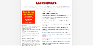
And here’s the new design, largely completed:
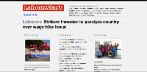
You can view the old home page here and the new one here.
Some things to note about the new design and why I believe it is a huge improvement over the existing design (which is not to say that it is perfect):
- There is considerably more white space for a much less cluttered look.
- More prominence is given to images (photo of the day, campaign photo).
- There’s a much reduced colour palette (no more pinks, blues, oranges, etc.) and single font for the whole page.
- The technology back-end of the page is largely future-proof, as it was written in HTML 5, uses CSS and is based on PHP – it’s completely modular and it will be relatively easy to base all the languages on this model.
- We’ve de-cluttered — there’s far less happening on the front page, and nearly all the links will now be moved to other pages. The key stuff – news, campaigns, labour history and photo – are the only things staying on the front page.
- Yes, there’s a new logo too. For the first time since 1998.
We’re not going live with this just yet — let’s have a discussion here, in the comments, before we do anything rash.
I know that I’m taking a risk with all this, as people have very different tastes and some of you will think this looks horrible while others think it looks great. What I’m looking for is constructive criticism — things that you’d like dropped, improved, added, displayed differently, and so on.
9 Comments »
RSS feed for comments on this post. TrackBack URL
Yes, new design may be easier to navigate and absorb. Fewer colors preferred — I always had a problem with the PINK Act Now!
However, I would like to see the presently used LabourStart logo maintained.
— Roy
It looks better – an improvement. A few remarks:
Could you make the news colum (the middle column) wider for breaking news? The news get quite compressed and drown in the other stuff. In my opinion they are much more important than “Today in labour history”. News is what people are looking for, our main mission besides campaigns.
I suppose we have to find out how this should be adapted to the national language sites, like the Norwegian. We could make those better as well – for example include “Photo of the day” and Act Now-pictures. Main headline and prioritized news we should not have, though.
I am usually resistant to design changes. I didn’t like it when the New York Times went from eight to six columns. But I really like the new design.
Will there be a sport for correspondents sign-in on the front page.
The design is certainly more “actual”, but…
As is, I find it derouting. That the Lebanon title be where it is (and I suppose the title will constantly change) throws me out and my eye searches for a follow-up without finding one.
Perhaps a larger logo in this position would be better with a slogan in it’s actual top-left position explaining who we are.
I agree with Espen that the news titles section should be larger and it’s title more prominent. Whether the other two columns are both to one side or separated or of different widths is another matter.
“Breaking news” is actually older news than “Today’s news” underneath. I suppose this will change but once again, it’s derouting. When you get to the bottom of the column, where does the eye go? And we don’t have the breaking news/top stories concept in other languages.
Thumbs-up for the language box.
I quite like the logo but as it’s elongated, we’ll have trouble with Facebook and others. Can’t go on being mugs forever, lol.
As said before, we lose in identity with no slogan.
Sign-up to newsletter needs to be more prominent.
No menu bar means thing will be more difficult to find (newswires, etc.)
Will this have to be hard-coded for each language? Couldn’t we do it as a WordPress theme and page with widgets containing your scripts, which would make it much easier to reproduce, translate and harmonize all our stuff?
One of the advantages of the 2-column format is that the photos can be larger. If Espen’s suggestion is adopted–that the center column should be wider–then the photos get even smaller if they are in the first and third columns. Perhaps the top of the page can stay two-columny but the lower portion could be threey?
Still think we ought to keep present logo AND keep “Where trade unionists start their day … ” as part of the logo on the top left.
I don’t have a problem with smaller photos as in most cases they are enlargened when clicked upon. Perhaps we could envisage some sort of lightbox or zoom on mouseover.
Slogan space is especially important for the non-English pages where LabourStart is meaningless.
Overall I am happy with proposed new look. I do agree we should not change our logo. and I do agree we should have on home page the log-in for existing correspondents and the invitation for people to become correspondents.
Can we also change the colour/bold all words ( maybe the same as the country name colour) for the words listing how many more stories available from that country – 4 more labour news stories from New Zealand today. so people visually easily note there is a lot more to be found if they click.
Eric,
Apart of giving my 100% support to the comment of Roy, I’d like to notice that the new logo is just a disaster. Shall I look into it for you?
Reflecting on this, we’ve all answered the question asked and given opinions on whether we find the new page prettier, with or without ideas as to how we think it could be even prettier. But no-one has asked the essential questions: what should this website be doing for us? Why do we want people to come here?
Some would say we should run a survey to know what our users actually want.
As it is, we have a proposed front page without a single word about who we are or what we do, and even worse, all the links in the first two columns take us to offsite pages and even the third links to our campaigns which don’t have the same graphics chart. In SEO terms, it’s a disaster. For the stats too, it does nothing to keep people on our site. Once they have clicked a link, they have to use their browser’s back button to return to it, so more visitors we have, less time they stay.
The new page promotes Facebook, Twitter, LinkedIn and YouTube, all private company ad-based services which can take us out, wholly or partially, at their whim (like Derek at one time), something we have denounced several times.
Shouldn’t we have a block, roughly where the main news title is on the proposed page, perhaps a slider, with rotating images and captions explaining what we do: Building solidarity, campaigning, news database, Banalizing IT for unions…? All, with the unique objective of getting people to leave their email address. Indeed, why not “sell” usage of the news database or newswires in exchange for an address rather than for free or a promise?
Eric mentions the necessity of it being “future proof”. To be true to this concept, we need something easier to manage for us laymen who don’t have Eric’s coding skills. I’ve already mentioned this somewhere, but building on a WordPress multi-user platform or BuddyPress would give us multilingual functionality, the ability to integrate scripts in widgets to compose secondary language pages, offer blogs to members (replacing UnionBook) in any language, run our own photo gallery (rather than Flickr), run surveys, training programs and more on our own site. And all of this is GPL with an enormous (again multilingual) ever-stronger support community always producing new plugins and themes or willing to help out for free. And if you need paid mods, you can easily find programmers too. Lastly, “future-proof” is being more than one to work on such a project.